
Wednesday, 16 December 2015
Improvements to make for my magazine
These are the things that need to be improved with my magazine, just some minor things changed could change my grade by far.
Monday, 14 December 2015
evaluation progress

Thursday, 10 December 2015
Wednesday, 9 December 2015
Progress of the plan
Today during the lesson i managed to get to get up to questions 3 of my Evaluation of Technology methods, i hope by next lesson to have finished all the questions and start working on my draft which i will try and get done before the christmas holidays. 
Friday, 4 December 2015


Friday, 27 November 2015


Thursday, 26 November 2015
Contents page: Progress

Wednesday, 25 November 2015
Contents page progress

Friday, 20 November 2015

Thursday, 19 November 2015
DPS PROGRESS

Wednesday, 18 November 2015
Front cover working progress

Monday, 16 November 2015
Working progress for the contents page

Thursday, 12 November 2015


Thursday, 5 November 2015
Saturday, 17 October 2015
Magazine Masthead Practice
Today in lesson I learnt how to use adobe illustrator to design my masthead (shout out to Tom the technician for the workshop!)
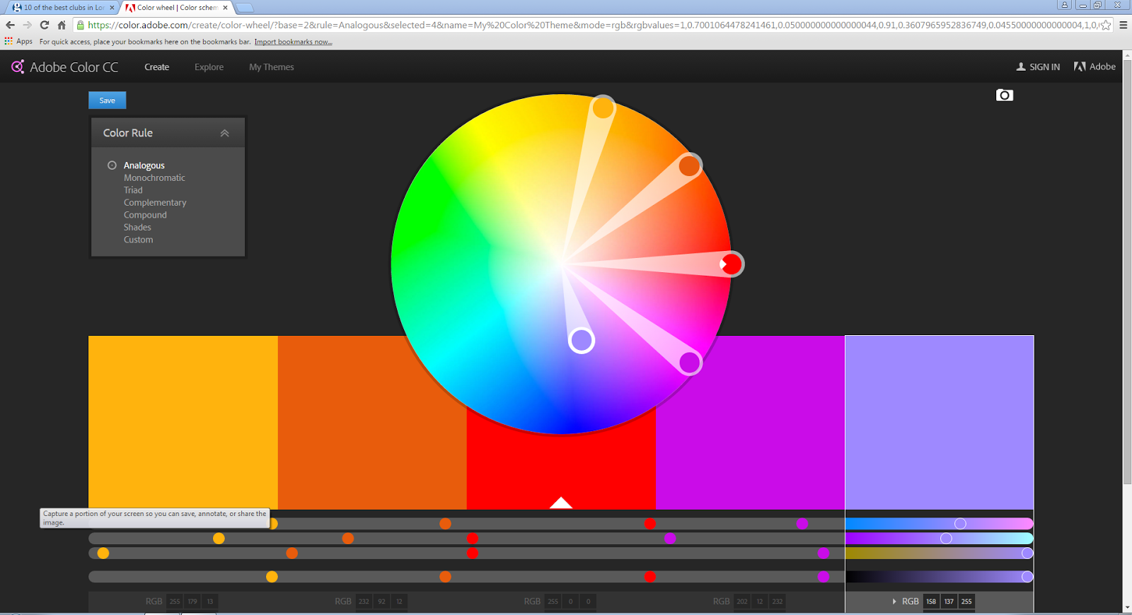
We used a website called color.adobe.com which showed complementary colours when you picked one. This tool to use is useful so you know that the colours you pick will look good on your front cover, contents page and double page spread.
I learnt a lot of things such as how to space out each letter from eachother. Also how to add stuff, delete stuff and so on...
Overall I don't think I'm going to use this masthead as my final one because I wasn't very pleased with the outcome. One of the things I don't like about it is that I added too many things on it, making it too visually busy. For my magazine I am going for a not over the top and not visually busy look. I'm chose a look like that because I want it to correspond to house music which is stylish and not over the top. Another thing I did not like is the colour, even though I want one colour masthead this one looks very boring and not stylish. I'm going to try and experiment with different colours and different font designs to suit my likings.
All of these images are my progress of my I got from a simple word that said "BassMagg" to a interesting design that however does not suit the house music theme


Friday, 16 October 2015
Distribution of magazines
I went to a corner shop to explore the the minimal choices they had. They had kerang and NME as the main magazines. These magazines or probably much more popular and sell better then other ones. The magazines were placed kind of laying down and only the top of the magazine behind kerang is seen. Editors create the masthead as carefully as they can because that is the only thing the person searching for a magazine is going to see.


However when it comes to shops buying that magazine to sell it they never make a loss because of the sale and return method. This is where the distributors give the shop back their money for the number of magazines they didn't sell. This is a massive benefit for the shop owners but for the magazine industry and the distributors it's a massive disadvantage. This is because they could probably end up loosing so much of their money and recycling the papers is costly to!
When it comes to the magazines at the front, the most popular is there which is this case is kerang. For those magazines they have to be more careful with their cover because that's what is going to be seen. However for the less popular magazines at the back it's more about how the masthead looks because that is what will grab the persons attention.
http://www.centuryonepublishing.co.uk allows you to publish your magazines online which is a massive advantage because there's no money lost because the required amount of magazines weren't sold also it's saving the trees that provide us with oxygen.
Another way magazines are distributed is via the post. This is an advantage to the reader because it arrives to them at the door and also earlier so you see all the latest news before the rest of the world. In a long term you end up saving lots of money because of all the monthly/yearly plans.
One of the most popular ways of the distributing a magazine is by direct distribution which is where you get your magazine for free in the tube/train station. The magazines are almost always free which is why they are full of adds because who else is going to pay for the magazine. Having all the adds in there is a disadvantage because the articles aren't as detailed or well written as they use to be when they charged people for the magazine.
Thursday, 15 October 2015

Monday, 12 October 2015
Ideas From my case studies
In my case study i got a tonne of inspiration from the magazine mixmag. The calm neutral colours is something i'd like to recreate because they create a calm atmospheric look. The calm colours make the magazine look very stylish and stylish is something that you would associate with people that listen to house music.
SELF EVALUATION ON FRONT COVER & CONTENTS PAGE
SELF EVALUATION
In my magazine I wanted to achieve a professional edit look,
I wanted to achieve this look because it makes my blog look more on the
experienced side. Having a good start on how to create a magazine makes you
learn more things when it comes to making more in the future, the more you push
yourself the more you will learn to use the tools. In my contents page I learnt
how to adjust the opacity of something whether it’s a photograph or just a box.
Another thing I learnt on indesign is that every time you design a page you
have to use gutters, which allows you place everything evenly so it is not
placed anywhere all over the page.
In my opinion my front cover is designed well and the colour
scheme correlates with Image used, further more I believe that all of the
things placed on my page is laid out neatly. This is important because it gives
the cover a professional look. Also I used a puff on the bottom of my front
cover to grab the readers attention because there could be something important
inside the magazine. I used the same colour as the masthead for the puff to
create that link creating a colour scheme effect. One thing I did not like
about my front cover is some of the tones in the colour scheme were too light
and could be hard to see for some people. Also I could of added a price tag
onto my cover page because if the magazine costs more than the person expected
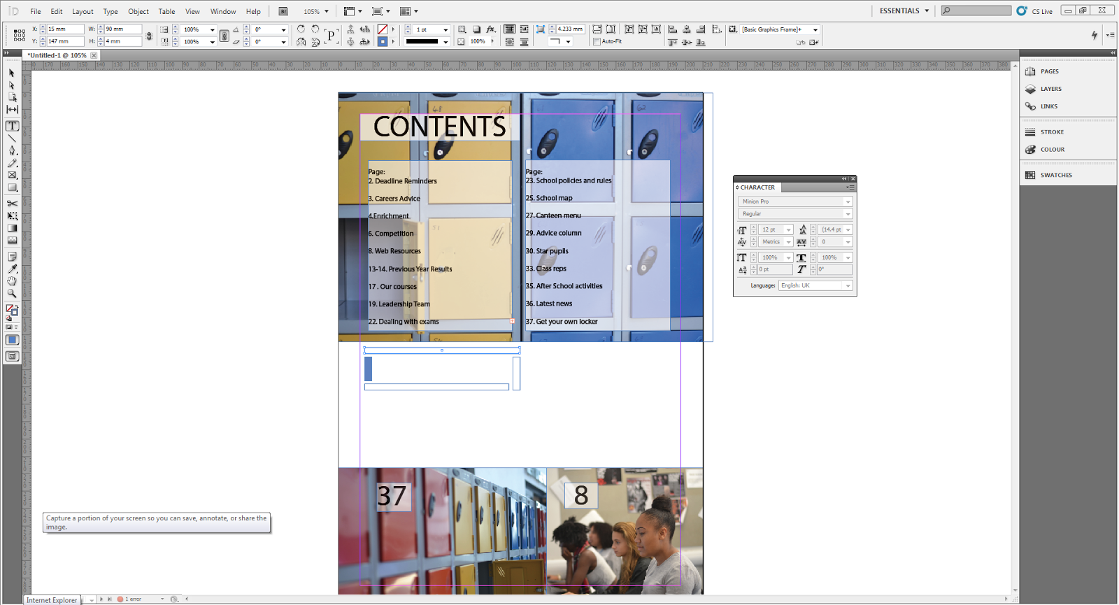
then they might complain and avoid buying the magazine. My contents Page has a
good colour scheme correlating to the lockers in the photograph. The designed
text boxes in the centre have been matched with the colour of the lockers by using
the eyedropper tool.
My peers pointed out that the photograph in the main cover
has 3 different shades of pink which kind of confuses the person that’s looking
at it what is the colour scheme. Another thing they said was that I should add
more images to my contents page, because it doesn’t tell us a lot about the
college only that we have lockers and we do work on computers. I need to add
some documentary styled photography where their social life is captured.
Firstly, one thing I personally think I can improve on is,
placing the sell line in a different place because it was placed awkwardly on
top of the mast head on the front cover. Secondly, the placing of the pages on
the contents page is too close to the edge of the box leaving the rest of the
box kind of empty. Lastly, I believe that I can improve on the font size. The
font size is very small however I don’t think that’s a big problem because the
demographic of the magazine has good eye sight, not all but most.
Wednesday, 7 October 2015

Monday, 5 October 2015
Contents page progress

My Progress
- I matched the colour of the boxes to the colour of the colour of the lockers creating an effective colour scheme.
- i used white boxes on top of the pictures and then reduced the opacity to around 62% so the lockers are still seen in the background.
- I matched the colours of the locker by using the eyedropper tool so the colour is matched accurately from the colour wheel.
Friday, 2 October 2015


My evidence of progress:
- I matched the masthead to the jumper that the model is wearing.
- The puff on the bottom left of the magazine has also been made the same colour as her jumper.
- i made the main cover line both white and pink, the colour in the models jumper, the masthead and the puff on the side.

Tuesday, 29 September 2015
DJMAG Media Pack
• this is the age demographic is which the readers are, the average age is 25.7 and 97% of the readers are male
• 67% of the readers go clubbing once a week so this is a great place to advertise new clubs and meeting spots.


- In my opinion this magazine is not something that inspires me because the bright and explose colours make the magazine too visually busy.


Mixmag Media Pack
• mixmag are people that make trends happen, so if someone wants some short of coat or shoes to go stylish they can advertise their product in this magazine.


• they also love the latest tech, such as dj equipment and stereo type of technology
• 72% of the readers are male and 28% are female. Which means most of the adverts are going to have to be aimed at the male demographic around the age 24.


- This magazine inspires me because of the calm colours and stylish look.
- The colours that they use on the front cover i am going to try and mimic that and create a magazine that is categorised as 'cool'
Double spread page: DJMAG
The image is a silhouette of most likely the person that the article is about. This makes the person look like a mystery man as if he is hiding his identity. The butterflies on his hunger connote a transformation of a free spirit within his line of music.
The kind of one colour scheme hints the genre of the magazine because using one calm flat colour makes it look stylish. Style is usually associated with people that listen to house music. On the page are 3 columns where there is an interview conducted of the person on the page 'Paul Woodford.' The interview talks about how he signed to a big label XL. The interview starts with talking about how amazing the label is and how the music makes people feel, the editor used very descriptive words which almost makes you feel a vibe in your stomach. Paul talks about his childhood and how he got into the dj music life, this gives us more insight and a bigger understanding of what music could mean to some people especially Paul.

Everything is set out in columns which gives it a neat look, making a double page spread look neat is important because it is promoting that thing that you're talking about.
The orange on the margins match the main title. However the main title is mixed with black and orange. The main title has a cracking effect, as if the text is about to burst out wth lava. The colour orange is associated with tropics which connotes that his music could be exotic and tropical. Some DJ's like putting a twist on their music by adding cultural preferences.
The background is of a army pattern, however it is very pixilated giving it an abstract video game effect. However at first glance it looked like the oceans waves when you're underwater, which could connote that his love for music is deeper than the ocean.
The silhouette is overlapping the margins which shows that he's the main star and nothing gets in his way.
The kind of one colour scheme hints the genre of the magazine because using one calm flat colour makes it look stylish. Style is usually associated with people that listen to house music. On the page are 3 columns where there is an interview conducted of the person on the page 'Paul Woodford.' The interview talks about how he signed to a big label XL. The interview starts with talking about how amazing the label is and how the music makes people feel, the editor used very descriptive words which almost makes you feel a vibe in your stomach. Paul talks about his childhood and how he got into the dj music life, this gives us more insight and a bigger understanding of what music could mean to some people especially Paul.

Content page analysis: DJMAG
The font colour has been colour coded to the text box header to create that sort of connection so it doesn't look like the colour is on the page on its own. On the left side of the page they used a yellow text box just on the background. This is so the person knows where the texts finishes.

This contents page has a lot of colours for headers, this helps everything to get categorised into different sections. In my opinion however I don't think that is the best approach because when I see a of colour all over the place it does not look good in a professional prespective.
The pictures have been numbered with pale white texts. This tells us where the article is with the image included. They do this becaus they might find an image interesting and want to find out more about it, whether it's the photographer or what the article is about.
The images are typical/conventional to this magazine. When it domes to house music the images are mostly outdoors at festivals representing a kind of chilled environment. The pictures of the tech could almost be an advertisement towards items that could be sold via the magazine. That is why you can see page numbers on the images to inform the reader that there could be latest deals and possibly give aways of merchandise. Also the use of the images give the genre a more complex look, as if it is not easy to create good music and a lot of knowledge is needed to use the technology that they do.
Leaving gals between the images create a sort of frame that lifts the images off the page. This is important because it helps us differentiate it from another image and not think that they are together.
The layout of the page is very neat , everything is divided into columns to give it a clean professional look.
Front cover analysis: DJMAG
The image is of a man with glasses, a grown out beard and a huge rain coat with a hoodie on his head. The stylish/photographer probably dressed him like this to give him a more alternative look. This is usually the case when it comes to house/electro/live music.
The coverlines are very short and snappy helping us to understand the story we're planning to read. In one of the coverlines it says "detroits unsung heroe." This creates a sense of mystery because no one knows who those "mystery" singers are, this draws you in to read the article.
The colour used is orange/yellow and red. The red is from the masthead and the yellow/ orange is from the background. This magazine cover is very dark in some parts, this is what makes us look at his face and text more because those are the brightest bits of the cover.
This front cover is very visually busy, this means that the person looking at it constantly has his eyes on something.
This magazine cover has for 2 puffs both promoting something inside the magazine (self promotion.) This also helps the page get full and not have any empty spaces.
The background of the model is of an explosion emphasising the fact that his music is explosive or to say that his mixtape is fire. On the other hand it could be fireworks in the background that would connote an outdoor festival environment.
The cover line is white and orange which is part of the colour scheme. The word 'detonates' is a good description of what his music sounds like. It gets the reader interested because using such vocabulary to describe music surely tells us that his mixtape is fire.
The biggest genre clue that we see is the masthead which says 'DJ' but also his style. His style is very urban and alternative which is what you would see in a dj or house/electro house music lovers. That demographic of people tend to stick out from the crowd and have their own original style also experimenting with others.
Double page spread: MIXMAG
The double page spread is made very simply, calm colours and large images just like the other pages in this magazine. They make the images big because that is the only way you can to see what the atmosphere is like to be at a house festival for example.
The pull quote from this dps is on its own, not very close to the rest of the text. This could show how important that piece of text is and should 100% be looked at when starting to read the article.

The image is placed slap bang in the middle, even crossing through the double page and the text is written around it. The image shows people partying which is how the youth is represented nowadays, party non stop go sleep and repeat. In my opinion house magazine is all about partying so to show this image, makes everything correlate with each other. This image is also showing about a festival/party that has happened which is what the dps is about, it could create a sense of jealousy for some readers because they probably really wnated to attend it but didn't. Now reading about it could make them a bit frustrated and angry that they did not attend. Once again there's not too much written because that tends to bore someone that likes this genre, they prefer having more images to look at. The layout of this double page spread is neat. Also to fill up the space MIXMAG went ahead and added more stuff to the double page spread which is a separate kind of list of "famous five." Reading that it could be anything so it kind of draws the reader in.
There is a puff on the page to identify the place where you should start reading and also it's just to add a bit of colour to the page and interesting shape.
The red dropcap correlates to some of the texts because some are written in red to create that kind of colour scheme.
The pull quote from this dps is on its own, not very close to the rest of the text. This could show how important that piece of text is and should 100% be looked at when starting to read the article.

Contents page analysis; MIXMAG
This contents page is very simple but yet effective, the black background really lifts the images and the text off the page.
There are not too many images on this page which doesn't make you look around everywhere. This is organised which most people like to see, a lot of people including myself always end up getting confused with where everything is on the contents page. As if a contents page needs a contents page so you'd know where everything is.
There are only 2 columns in this magazine contents page and also a text box at the bottom of the first page (extra information)
The images all relate to the genre of the magazine which is house/techno/live performance music. It suits the genre because most of the pictures are of festivals and people just enjoying them selfs. Also you could say that it is mostly people in action, so it's not a studio kind of photo. In a sense it's more documentary styled photos.
MIXMAG the name I the magazine is still seen on he contents page on the top right hand corner.
The pictures are numbered and the size of them is bigger than in conventional magazine contents pages. They probably do this to make it proportional to the image size. If there's a large image it's better to have larger numbers because that's the only way you'll notice them.
The genre clues in this magazine are the images. The images are of outdoor events which the youth attend. (general demographic of mixmag) Outdoor events are usually associated with house music. Also another give away of the genre is the use of the colour black and the layout. This demographic of people tend to be more stylish and alternative. This is evident because the page is layout out neatly and in general is just pleasing to look at.

The genre clues in this magazine are the images. The images are of outdoor events which the youth attend. (general demographic of mixmag) Outdoor events are usually associated with house music. Also another give away of the genre is the use of the colour black and the layout. This demographic of people tend to be more stylish and alternative. This is evident because the page is layout out neatly and in general is just pleasing to look at.

Front cover analysis: MIXMAG
This front cover is effective because the colours are plain, simple but yet very attractive. This is because the black and purple give it a royal feel to it and the very light blue background makes it a bit warmer.
The way the person has their hands creates nice symmetry for the photo making it visually attractive. The person has a look that in modern day society we'd call "hippie." This look is very popular among 21st century adolescence.
This magazine cover is not visually over crowded which gives it a nice professional finish. This use of space allows you to observe the photo better and see everything. Also the use of space gives the magazine a very professional and clean cut look which is what actually attracts the eye of the demographic of people that read it.
The main colour of this magazine is purple, usually when this magazine makes a cover they make sure that the colours are simple on the image cover. However they will always use purple for their masthead purely because it's a rich colour. They also use black font in some of the coverlines however that's not usually considered to be part of a colour scheme because black is just seen and used the most.
Everything is layed out neatly and written in small letters to not over crowed the page. Having small letters makes the image and masthead appear bigger which is a good thing because it makes the person in the picture look more powerful.
The cover lines are black and bold and the test underneath it is colour coordinated with the masthead which is a light purple colour. The bold black colour creates a sort of colour scheme for the front cover, black and purple. The colour purple connotes royalty which is what the editor is probably going for.

The cover lines are black and bold and the test underneath it is colour coordinated with the masthead which is a light purple colour. The bold black colour creates a sort of colour scheme for the front cover, black and purple. The colour purple connotes royalty which is what the editor is probably going for.

Practice using Photoshop

This is a practice using photoshop.
I included all the typical conventions of a music magazine cover. Such as, a masthead, release date, bar code, main headline and extra information under the headline.
I made the cover line white just like the the strap on her shoulder. Even though the strap is barely noticeable it still gives it a certain professional effect. I made one of the lines black because I wanted there to be a bit of contrast, not just one colour.
The masthead is behind the persons head making her the star and the main focus. In Photoshop I used the rubbing out tool to make the masthead behind her.
I put the issue date on the right side of the magazine where there was an empty space to fill the cover up. I also used a black coloured font because I wanted the other part of the magazine where it is written in black to match.
Friday, 25 September 2015
College magazine plan

1. The cover lines are placed around the image and the same colour as the masthead to create a nice colour scheme.
2. The 'LSC' masthead was made blue because that is the main colour of the college. Also i have placed behind the model because it is a typical convention of a magazine. Furthermore it makes it clear that the model is the main thing to look at and the main advertisement for the college.
3. The model that i have quickly drawn on photoshop demonstrates the type of model I want. Someone wearing smart clothes and and has a huge smile on their face showing that the college is a great place to be.
4. I have placed a puff on the left bottom side of the magazine cover because it makes the magazine looks more busy. I would prefer the puff to have a special news on a certain page to grab the attention of the person looking at the magazine.
5. I have put a barcode on the magazine to give it a real sense of it being a real magazine out.
Note: This is not the final magazine cover, this is just a plan and how i want it to look roughly.
Subscribe to:
Comments (Atom)