Saturday 17 October 2015

Magazine Masthead Practice

Today in lesson I learnt how to use adobe illustrator to design my masthead (shout out to Tom the technician for the workshop!) 

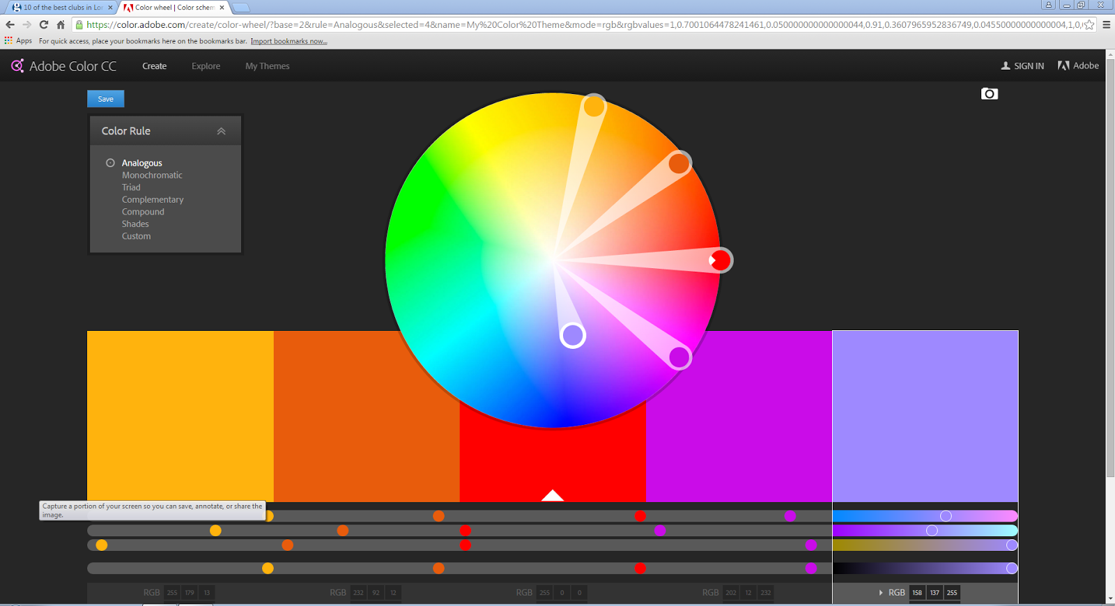
We used a website called color.adobe.com which showed complementary colours when you picked one. This tool to use is useful so you know that the colours you pick will look good on your front cover, contents page and double page spread. 

I learnt a lot of things such as how to space out each letter from eachother. Also how to add stuff, delete stuff and so on... 

Overall I don't think I'm going to use this masthead as my final one because I wasn't very pleased with the outcome. One of the things I don't like about it is that I added too many things on it, making it too visually busy. For my magazine I am going for a not over the top and not visually busy look. I'm chose a look like that because I want it to correspond to house music which is stylish and not over the top. Another thing I did not like is the colour, even though I want one colour masthead this one looks very boring and not stylish. I'm going to try and experiment with different colours and different font designs to suit my likings. 

All of these images are my progress of my I got from a simple word that said "BassMagg" to a interesting design that however does not suit the house music theme 


Friday 16 October 2015

Distribution of magazines

I went to a corner shop to explore the the minimal choices they had. They had kerang and NME as the main magazines. These magazines or probably much more popular and sell better then other ones. The magazines were placed kind of laying down and only the top of the magazine behind kerang is seen. Editors create the masthead as carefully as they can because that is the only thing the person searching for a magazine is going to see.

However when it comes to shops buying that magazine to sell it they never make a loss because of the sale and return method. This is where the distributors give the shop back their money for the number of magazines they didn't sell. This is a massive benefit for the shop owners but for the magazine industry and the distributors it's a massive disadvantage. This is because they could probably end up loosing so much of their money and recycling the papers is costly to! 

When it comes to the magazines at the front, the most popular is there which is this case is kerang. For those magazines they have to be more careful with their cover because that's what is going to be seen. However for the less popular magazines at the back it's more about how the masthead looks because that is what will grab the persons attention. 

http://www.centuryonepublishing.co.uk allows you to publish your magazines online which is a massive advantage because there's no money lost because the required amount of magazines weren't sold also it's saving the trees that provide us with oxygen. 

Another way magazines are distributed is via the post. This is an advantage to the reader because it arrives to them at the door and also earlier so you see all the latest news before the rest of the world. In a long term you end up saving lots of money because of all the monthly/yearly plans. 

One of the most popular ways of the distributing a magazine is by direct distribution which is where you get your magazine for free in the tube/train station. The magazines are almost always free which is why they are full of adds because who else is going to pay for the magazine. Having all the adds in there is a disadvantage because the articles aren't as detailed or well written as they use to be when they charged people for the magazine. 

Monday 12 October 2015

Ideas From my case studies

In my case study i got a tonne of inspiration from the magazine mixmag. The calm neutral colours is something i'd like to recreate because they create a calm atmospheric look. The calm colours make the magazine look very stylish and stylish is something that you would associate with people that listen to house music.

SELF EVALUATION ON FRONT COVER & CONTENTS PAGE

SELF EVALUATION

In my magazine I wanted to achieve a professional edit look, I wanted to achieve this look because it makes my blog look more on the experienced side. Having a good start on how to create a magazine makes you learn more things when it comes to making more in the future, the more you push yourself the more you will learn to use the tools. In my contents page I learnt how to adjust the opacity of something whether it’s a photograph or just a box. Another thing I learnt on indesign is that every time you design a page you have to use gutters, which allows you place everything evenly so it is not placed anywhere all over the page.
In my opinion my front cover is designed well and the colour scheme correlates with Image used, further more I believe that all of the things placed on my page is laid out neatly. This is important because it gives the cover a professional look. Also I used a puff on the bottom of my front cover to grab the readers attention because there could be something important inside the magazine. I used the same colour as the masthead for the puff to create that link creating a colour scheme effect. One thing I did not like about my front cover is some of the tones in the colour scheme were too light and could be hard to see for some people. Also I could of added a price tag onto my cover page because if the magazine costs more than the person expected then they might complain and avoid buying the magazine. My contents Page has a good colour scheme correlating to the lockers in the photograph. The designed text boxes in the centre have been matched with the colour of the lockers by using the eyedropper tool.
My peers pointed out that the photograph in the main cover has 3 different shades of pink which kind of confuses the person that’s looking at it what is the colour scheme. Another thing they said was that I should add more images to my contents page, because it doesn’t tell us a lot about the college only that we have lockers and we do work on computers. I need to add some documentary styled photography where their social life is captured.

Firstly, one thing I personally think I can improve on is, placing the sell line in a different place because it was placed awkwardly on top of the mast head on the front cover. Secondly, the placing of the pages on the contents page is too close to the edge of the box leaving the rest of the box kind of empty. Lastly, I believe that I can improve on the font size. The font size is very small however I don’t think that’s a big problem because the demographic of the magazine has good eye sight, not all but most. 

Monday 5 October 2015

Contents page progress


My Progress
  • I matched the colour of the boxes to the colour of the colour of the lockers creating an effective colour scheme. 
  • i used white boxes on top of the pictures and then reduced the opacity to around 62% so the lockers are still seen in the background. 
  • I matched the colours of the locker by using the eyedropper tool so the colour is matched accurately from the colour wheel.  

Friday 2 October 2015

Final College Magazine Cover


My evidence of progress:


  • I matched the masthead to the jumper that the model is wearing. 
  • The puff on the bottom left of the magazine has also been made the same colour as her jumper.
  • i made the main cover line both white and pink, the colour in the models jumper, the masthead and the puff on the side. 


FINAL COLLEGE MAGAZINE CONTENTS PAGE